Typography Research
Typography
The typography and opening credits are often the first clue that the audience has to a film's theme and tone, so it is therefore extremely important to create the right typography that will match the genre and entice viewers. To research this, we looked at the different titles for films of the horror and thriller genre.
1. Psycho
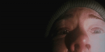
 Psycho's black and white title sequence consists of bars sliding onto the screen from different sides, gliding through the typography slowly revealing the words to the viewer. it is simple, yet effective and intriguing. The stark white letters torn and seemingly pasted together against a black background resemble a ransom note and is intended to illustrate the homicidal madness of the main antagonist, Norman Bates. This clearly relates to the plot of the film and creates a fairly sinister atmosphere from the outset.
2. Se7en
 This psychological thriller has a fairly dark and mysterious opening. The typography is scribbled over close up shots of photos, newspaper cuttings and razor blades. It was created by being hand etched into a black surface scratchboard and was then manipulated during the film transfer process to further jitter it. This adds a feeling of distress and makes the audience feel uneasy. In addition to this, it introduces the key theme of violence, which is significant throughout the whole film, further helping to establish the tone. It allows an intimate look into the disturbed mind of a serial killer, developing the plot of the film also.
3. Dr Strangelove
 The opening sequence of Dr Strangelove was way ahead of its time and amazingly, was all done by hand with grease pencil on glass. The most appealing part of this ride in the sky title sequence is the thick sans serif typeface 'Strangelove' overlaying the thin and oversized text 'Dr'. The aeroplanes used in the opening are supposed to be phallic imagery that set the scene for the comedic and humorous feel to this film.
4. Alien

Tense cinematographic build up of segmented letterforms creates a dark and intriguing setting. It was actually fairly simple to create this sequence but it creates tension and introduces the audience to the mood of the movie perfectly. The futuristic lettering and background match with the sic-fi genre of this film.
5. Rocky Horror picture show

This typography is very effective because the words are dripping with blood, which conforms to the horror genre, but they also are drawn quite thick and childish, which conforms to the comedic feel of the film. The red seductive lips grab the audience's attention at the start and then the typography jumps suddenly accompanied by drums. The film is strange and captivating and this is captured very well in the opening credits.
The typography and opening credits are often the first clue that the audience has to a film's theme and tone, so it is therefore extremely important to create the right typography that will match the genre and entice viewers. To research this, we looked at the different titles for films of the horror and thriller genre.
1. Psycho

2. Se7en

3. Dr Strangelove

4. Alien

Tense cinematographic build up of segmented letterforms creates a dark and intriguing setting. It was actually fairly simple to create this sequence but it creates tension and introduces the audience to the mood of the movie perfectly. The futuristic lettering and background match with the sic-fi genre of this film.
5. Rocky Horror picture show

This typography is very effective because the words are dripping with blood, which conforms to the horror genre, but they also are drawn quite thick and childish, which conforms to the comedic feel of the film. The red seductive lips grab the audience's attention at the start and then the typography jumps suddenly accompanied by drums. The film is strange and captivating and this is captured very well in the opening credits.
Comments
Post a Comment